#pegabug redesign
Explore tagged Tumblr posts
Visit Tumblr Blog
Explore Tumblr blogs with no restrictions, modern design and the best experience.
Last Seen Tumblr Blogs


Fun Fact
69% of Tumblr users are millennials.
Text
All Characters in this AU are aged up and adults
————————————————-
Welp short hair Marinette has officially won you guys, I can’t help it she looks so badass with short hair that she’s completely stolen my heart.
Now this doesn’t mean I will be redesigning ALL her designs with short hair. No. Good lord no. I am just redesigning and designing her with short hair for the ones that have yet to be done. I also have been trying to redesign Pegabug for a while as I am not too happy with her redesign I did. It’s hard to draw and there’s too much to look at. Also it did not fit with Adult Ladybugs design at all! I will also be redesigning Ladybee too.
Currently I have almost all the Unifications done! Yay! I will be posting the rest soon and then we are on our way to chapter art town!
(Also I got told by my friend who is currently designing her own game!Yay her! That she looks like a Milf and that is one hell of a compliment)
#miraculous ladybug#miraculous tales of ladybug and chat noir#miraculous au#timey wimey…uh oh au#my art#marinette dupain cheng#fox’s art#pegabug#adult marinette dupain cheng#adult ladybug#miraculous fanart#miraculous unification#adult Pegabug#pegabug redesign#miraculous redesign#horse miraculous#kaalki#kwami#ladybug#tikki
191 notes
·
View notes
Text
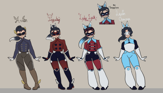
What's this? Unifications and Kwami swaps?!?
Part 2 of the unifications
While sometimes I can come up with ideas on what a unified miraculous should look like right away, like with Shadow Moth and Dragonfly, other times I struggle way less when I draw out the characters with Both miraculous first.
Viper Noir was kind of the exception since I very intentionally didn't want it to look like Aspik that much.
But for these designs I really felt it was important to get my designs out on paper first. SO! Let's talk Kwami Swaps and then we'll get to the unifications.
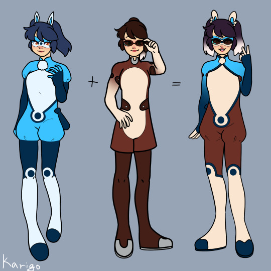
Since Pegasus already exists, I couldn't call Marinette with the horse that, but according to my brief research Arion is the name of one Pegasus form Greek mythology.
Much like with Chloe as Champion I base Marinette's on equestrian uniforms, and I've always treated blue as the horses accent color since that's the color of the Voyage portals. Keep the wings cause it both keeps with the greek theme and they look cute. And some little braids in her hair like some horses have to top off her Pony-tail. Also, assume the glasses are like- attached to the mask.
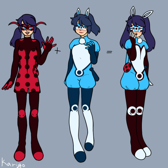
Lapin Chanceux (Lucky Rabbit) was the first design I did, albeit on paper, to figure out what I was going to do. I wanted to make her look different from both Bunnix's so I dropped the dark blue that I used for them and brought in more white and light blue.
I do like giving the rabbit holders some sort of poof around their hands or feet since it invokes the feel of a rabbits foot. In the Bunnix's it was around their arms, Marinette its her legs. The pom poms by her ears were added after the drawings was initially declared done but their so cute it was EASILY worth it.
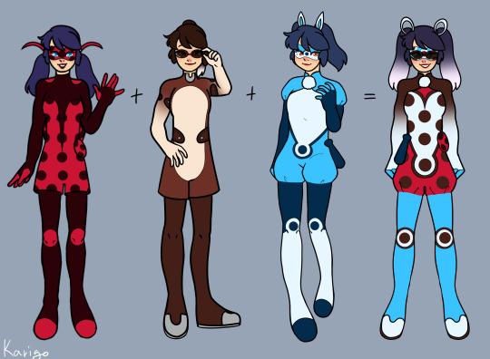
Onto the unifications, I've actually redesigned both Pegabug and Pennybug before. And the first Pegabug redesign is actually still up on my youtube channel as a speedpaint. Obviously the designs and my artstyle have changed drastically though.
I cut the brown from the design entirely, instead opting to darken the red greatly. But keeping the white accents which were in both my Ladybug and Arion's designs. I also moved the wings up to her pony-tail both because they slightly resemble horse ears like that, and in preparation for adding the rabbit.
Whenever I unify the Ladybug I cut down on the spots drastically because they can make it feel really cluttered. But I tried to keep them in places that made sense. Alluding to buttons on her coat, the ones at the ends of the stripes down her leg, which I kept from my first design. And giving her spots on her hands, just cause. Also got some shoulder pad action because I wanted to-
And finally Lady Luck. Because Pennybug sounds stupid- I assumed at the time we first saw her that Pennybug wasn't called Lady Luck because they were saving it for if when unified the Ladybug and Cat. But no, that's Bug Noir, which also sounds dumb.
So we're going Lady Luck. Since Horses, Rabbits, and Ladybugs are all associated with good Fortune.
That being said- no one should be allowed to combine 3 miraculous on the sole pretense that they almost always look bad. Pennybug looked bad, Shadow Noir (also stupid name) looked bad, Monarch is his own can of worms, but- well you'll see.
I knew I wanted to more the glasses to the top of Lady Lucks head, just because I was kinda getting sick of the normal glasses. Assume just the lenses are the miraculous and the frame changes for the user. Now they are attached to goggles- not that you can really tell because they have black straps on Marinette's dark hair.
The ear/wings were the only thing I knew some people liked about Pennybug so I kept those, albeit without the black ring around the blue. And add white to the ponytail gradient. White gloves because they looked good, and I almost always give Marinette opera gloves.
She gets a few more smaller spots since the rabbit also uses them. And combine the riding coat with the the- it's not really a shrug but I don't know what to call it? Keep the wide pants because why not, and make the red a darker cool red. The blue could have also been changed to better match the pallet but the vibrant blue is an accent I use on all the miraculous' usually so it got to stay. So long as the suit is red I think it still reads as a Ladybug.
Last thing to note are the eyes. Lady Luck's eye look freaky because she's using three miraculous and probably shouldn't. And Lapin's eye's are pink/red with white pupils because my family actually had californian rabbits at one point and they all looked like that in photo's.
Bonus- here's the doodles I did years ago for Pennybug
and Pegabug
#miraculous ladybug#miraculous redesign#miraculous fanart#ladybug miraculous#marinette dupain cheng#marinette redesign#kwami swap#miraculous unification#rabbit miraculous#horse miraculous#pegabug#pennybug#lady luck#arion#lapin chanceux#I'm gonna take a nap now-
89 notes
·
View notes
Text

Pegabug redesign! 🐞🐴
#miraculous#miraculous fanart#miraculous ladybug#miraculoustalesofladybugandcatnoir#marinette dupain cheng#redesign#pegabug#miraculous redesign
33 notes
·
View notes
Text
"Tikki, Kaalki, transformation de fusion!"
Aka my redesign of Pegabug and design of Horse!Marinette


Pegasus (Horse!Marinette) is on the left and Pegabug is on the right
Pegasus and Pegabug were fun do work on, even if trying to combine Pegasus and Ladybug's suits was pretty complicated
For Pegasus' design, I took inspiration from cowboy/cowgirls, using it to mostly inspire the shirt which is supposed to resemble those ruffle shirts people wear underneath a vest, and the lighter marking gives the illusion of chaps
To further the cowboy aesthetic, I gave her a bandana that covers the lower half of her face rather than the face mask I've given her prior, I also put her hair down (it stops right at her shoulders) and made it gray to also bring together the cowboy look
As for Pegabug, she's kept her Ladybug suit for the most part, but now she has the shape of Pegasus' suit, and the shirt as well, on top of that the spots are all the dark brown from Pegasus' suit, her hair also becomes an ombre
I also decided to ditch her domino mask while unified because 1. having both it and a bandana is overkill and 2. I also found the sunglasses and domino mask combo she has weird
Since this is also the first of the unified designs I'm also going to mention that when someone unifies two (or more) Miraculous, then their height is whatever the average height between their forms is, so for Pegabug she's 5'6 since Pegasus is 5'7 and Ladybug is 5'5
#miraculous: magical connections#miraculous ladybug#rewrite#miraculous rewrite#miraculous tales of ladybug and chat noir#miraculous#miraculous: tales of ladybug & cat noir#ladybug redesign#miraculous redesign#character redesign#redesign#marinette dupain cheng redesign#marinette dupain-cheng#pegabug#horse!marinette dupain-cheng
5 notes
·
View notes
Text


I decided to redesign all Mari's Ladybug unification with my own design conventions and rewrite around how unifications work. Each unification would also have what I like to call a unified power but to go through the unified weapons: Dragonbug: Dagger on a string/rope Bugnoire: Either a small morningstar-type modification of the bow staff with the ball on the end or a flail Ladybee: Flail without the handle (idk if it has a particular name please tell me if it does) Ladyfly: Microphone Multibug: Whip Pegabug: Frisbee Pennybug: Chakram
#miraculous#miraculous ladybug#mlb#miraculous unification#miraculous fanart#bugnoire#ml redesign#dragonbug#ladybee#ladyfly
49 notes
·
View notes
Photo
I think my favorite is Pegabug, I’m kinda meh on others... I struggled a little with the eye combinations and you can’t even see them that much xd
Lady Bee and Dragon Bug are next!!
#my art#miraculous ladybug#miraculous ladybug redesign#marinette dupain cheng#kwami swap#ladybug#lady hooves#lady clock#pennybug#pegabug#bunnybug#pegabunny#unification#kwami fusion#horse!marinette#rabbit!marinette#rabbit miraculous#ladybug miraculous#horse miraculous#pegabug redesign#pennybug redesign
95 notes
·
View notes
Note
If you were to redesign Pegabug what would she look like and what would you call her?

I also tried some recoloring of canon to make it less of an eyesore, but now she kinda looks like she has the Deer Miraculous instead ::>_<::
And as cringey as Pegabug is, I tried thinking of something else and came so short. How do you merge Ladybug and Horse? LadyMare? HorseBug? (HorseFly?) LadyPony? Red Beauty? LadySus (ha!)? Lady Voyage? (wait she might activate her power).
But anyway, Sentibubbler (might) be the first episode that Chat Noir and Ladybug get to lay eyes on ShadowMoth's new look. I hope they rip him a new one. "You finally get a power upgrade and that's the look you go for?"
3K notes
·
View notes
Text
Finally decided to do a redesign of Pegabug. I'm happy with how it came out and I'd also change the name as I don't like Pegabug. It seems uncreative to me. I would personally go with Coleoptera which is the scientific name for the horse beetle. Anyway here's my design.

#miraculous ladybug#miraculous#redesign#pegabug redesign#pegabug#marinette dupain cheng#miraculous unify#miraculous merge#horse miraculous#ladybug miraculous
34 notes
·
View notes
Text

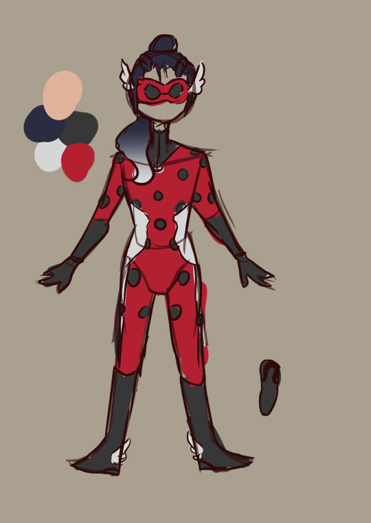
fixed it
24 notes
·
View notes
Photo

COWBOY THEMED SUITS!!!
#Also “pegabug” should be called lucky bet cause she is a lucky horse and you bet on horses#miraculous ladybug#ml#no spoliers#ml redesign#pegabug#horse miraculous#my art
35 notes
·
View notes
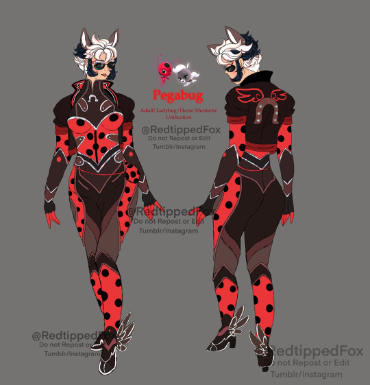
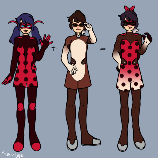
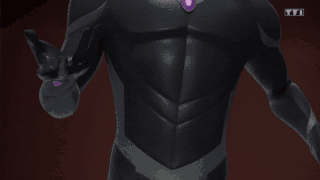
Text

Adult!PegaBug, I wanted to change her design completely, I just didn’t like PegaBug’s original design, don’t get me wrong it’s cute but seeing how cool and detailed Pegasus design was I was a bit bummed that they didn’t add any of the cool belts or even do a spotted horse look. I wanted to play with Marinette’s bangs because I thought it would be cool if her bangs were pushed back.
I based her design off of these horses:
Down Below are her concept designs:

#miraculous ladybug#miraculous tales of ladybug and chat noir#my art#Fox’s art#timey wimey…uh oh au#pegabug#pegabug redesign#older marinette#adult marinette#miraculous unification#kaalki#tikki#ladybug miraculous#horse miraculous#ladybug#miraculous au#marinette dupain cheng
87 notes
·
View notes
Text
Miraculous Redesign Index-
(Now with Kwami Swaps!) I'll update as the Redesigns happen
Marinette- Civilian & Ladybug, Lady Noire, Multimouse, Cosmo-Bug, Cute Doodles, Huli Jing, Honey Bee, Dragonfly (Dragonbug) and Lady Bee, Arion, Pegabug, Lady Luck (Pennybug), and Lapin Chanceux
Adrien- Civilian & Chat Noir, Mr. Bug, Aspik, Astro-Cat, Mr. Bug First Sketches, Cute Doodles, Viper Noir (Snake Noir)
Alya- Main Page, Cute Doodles
Nino- Main Page, Cute Doodles
Chloé- Main Page, Cute Doodles, Champion
Gabriel- Main Page, Shadow Moth
Nathalie- Main Page
Kagami- Main Page, First Sketches
Luka- Main Page, Little Luka
Lila- Main Page, Collette
Alix- Main Page, Little Bunnix First Sketches, Cani-girl
Juleka- Main Page, Little Juleka
Mylene- Main Page
Sabrina- Main Page
Rose- Main Page, Pigella First Sketches
Kim- Main Page
Marc- Main Page, First Sketches
Max- Main Page
Miracu-class Girls- Group Page
Miracuclass Boys- Group Page
Zoé- Main Page, Teen Zoé & Chloé, Little Zoé & Chloé, Little Vesperia Sketch, Teen Zoé Sketch, Kitty Noire, Cute Doodles,
Nathaniel- First Sketches
Rose- Main Page, Pigella First Sketches
Felix- Felix Civilian
------------------------------------------------------------------------------
Paris Special-
Emo/Alternate Marinette- Civilian & Shadybug, "Hero" Cocci, Shadybug Sketches, Cocci Sketches, Hell Cat, Red Queen
Emo/Alternate Adrien- Civilian & Claw Noir, "Hero" Wildcat, Claw Noir Sketches, Bloody Bug
Marinette- Ladyfly
Emo/Alternate Alya- Coccibella, Swarm
Emo/Alternate Lila- Volpina Phantasm
#miraculous redesign#miraculous tales of ladybug and chat noir#miraculous fanart#mlb redesign#Redesign Index#kwami swap
74 notes
·
View notes
Text

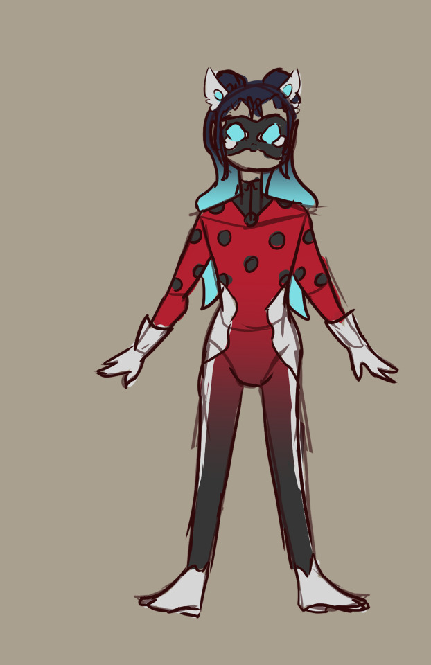
Pegabug redesign!
Hello, i'm new here! Wanted to show im working in a Pegabug redesign ^^
#marinette dupain cheng#miraculous fanart#miraculous#pegabug#miraculoustalesofladybugandcatnoir#redesign
15 notes
·
View notes
Text
Miraculous: Magical Connections Miraculous Holder Redesigns Master Post
Note: Ladybug, Chat Noir, Monarque, and Paon Aimant's designs are with their civilian counterparts, whereas everyone else's is solo
The groups are broken up into: Miraculous Holders, Temp Holders (for Multimouse, Aspik, etc.) Unifications, and Non-Canon (like certain unifications components like Horse!Marinette)
There's also a link at the bottom for all of my civilian and akuma/sentimonster redesigns
Miraculous Holders:
Ladybug and Chat Noir
Monarque (Hawk Moth) and Paon Aimant (Mayura)
Coursière (Pegasus)
Lapin Opportun (Bunnyx)
Rena Enfumé (Rena Rouge)
Carapace
Queen Bee
Arashi (Ryuko)
Temp Holders:
Māo (Lady Noire) and Crimson Beetle (Mister Bug)
Unifications:
Pegabug and Pegasus (Horse!Marinette)
Coniglio Noir (Rabbit Noir) and Coniglio (Rabbit!Adrien)
Hebi Tsukai (Aspik) and Hebi Noir (Snake Noir)
Multimouse, Hóng Hú (Fox!Marinette), Multibug, Multi Māo (Multicat), Multi Húlí (Multifox), and Lady Hú (Fox+Ladybug!Marinette)
Lapin Time (Rabbit!Marinette), Pegabun (Horse+Rabbit!Marinette), Lapin Bug (Chronobug), and Lady Pegabun (Pennybug)
Non-Canon:
Civilian Redesigns
Akuma/Sentimonster Redesigns
#miraculous: magical connections#miraculous ladybug#rewrite#miraculous rewrite#miraculous#miraculous tales of ladybug and chat noir#miraculous: tales of ladybug & cat noir#redesigns#art#master post
5 notes
·
View notes
Text
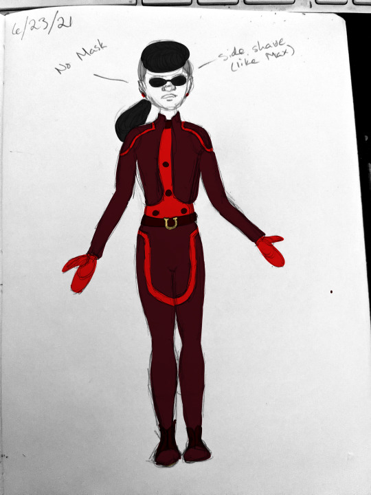
[Image ID: A photo of Marinette Dupain-Cheng wearing both the Horse and Ladybug Miraculous. The base of the supersuit is the same as the normal Ladybug design, with a skintight red suit that has black dots. However, over that, she wears a dark reddish-brown jacket that has red lines around the shoulders, and pants of the same color that have red lines which form a horse shoe shape around her thighs. She has a dark belt with a yellow horse shoe buckle and dark shoes. Her hair is in a long ponytail with a side shave. There's a line coming from the side shave labelled, "side shave (like Max)" and a line from the Horse Miraculous labelled "no mask." End ID.]
Lady Horse redesign
(I refuse to dignify the name "Pegabug" by using it on my design. Lady Horse and Horse Bug both would have been better.)
(Explanation of some of the design choices/why I dislike the canon suit under the cut; it got pretty long)
So. I hate the canon design for Marinette's fusion of the Horse and Ladybug Miraculous.
It's just bad, okay? I really did not like it one bit.
When designing this, I tried to tackle all of the biggest issues I had with it. A lot of it comes from the fact that the Horse and Ladybug really do not have aesthetics that can be well combined. The brown and red don't go together. Therefore, on my design, I didn't keep the brown that Pegasus uses, and instead went with a different color entirely. It's more maroon than brown but it looks so much better.
The other problem that I specifically had with the design is that the Miraculous aren't at all balanced in the fusion. It's like, 90% Ladybug with 10% Horse added in. Because the Horse doesn't have any particularly iconic parts of the suit (like the Ladybug has dots, the Bee has stripes, the Cat has ears, etc.) it ends up looking like a bad version of the Ladybug supersuit. Without the horseshoe symbols, you'd hardly know it's supposed to look like a horse at all.
I don't know if I solved this, per se, because this design tends to lean more toward the Horse than the Ladybug, but I wanted both animals to be visually stimulated in the design. By going with a somewhat equestrian feel for the Horse and keeping the base suit as the Ladybug, I think I got this.
In general I feel like Miraculous has really lacked on balanced fusions in this way. My favorite fusion ever is Dragon Bug because it was absolutely balanced between the two Miraculous. It looked both like the Ladybug Miraculous and the Dragon Miraculous, and it looked really good. The color schemes worked together. Snake Noir was balanced but not particularly well blended between the two; both aesthetics looked like they were competing. If they'd used the dark aqua color we see in both the canon Snake Miraculous holders to bridge between the teal and the black, it would have looked a lot better.
In Pegabug's design, the mask looks really weird with the Horse Miraculous, so I decided to cut the mask entirely and just do the sunglasses. Since the sunglasses act as a mask on Pegasus's suit, I feel as though there shouldn't be a problem with that in terms of identity.
Also, the writers of the show are too cowardly to do it so I gave Lady Horse a side shave like Pegasus has. I'm not a fan of the way that they constantly show powered up female characters with hair longer than their civilian identities (Rena Rouge, Renren, Pigella, Lady Noire, arguably Queen Bee, etc.) but I do like the aesthetic of the ponytail side shave (and, in fact, I'm growing that out right now; I'm at a warrior's wolf tail, in case you're wondering).
(Side note: I have Opinions(TM) about Marinette's hair being stylized as blue, but I think overall it's really starting to limit what they can do. Now that they're doing fusions more regularly, they have to take the blue hair into account with the color scheme, and a lot of times it doesn't look good. Pegabug is a great example of that. They have the Ladybug red, the Horse brown, a white gradient on her legs that leads to bonus pink, and blue hair. It's too much and the blue doesn't look good with it. That's not the only reason I chose to draw her hair as black in my photo, I also think the blue hair is slightly racist, but that's secondary.)
I didn't keep the white streak, partially because when I added it in it didn't look good and also I was getting Anna from Frozen vibes from it. However, that doesn't mean that I wouldn't add the white streak into a different drawing where it's better colored and more dynamic so it doesn't look like a weird line where I just. Forgot to color the photo in.
I didn't like the wings on the shoes in the original costume but I did mean to add them to mine because part of the reason they look bad is that they look ridiculous (utterly ridiculous) when she doesn't have shoes. I just, uh, don't have the talent (yet) to draw those wings from a front angle.
The red details on the brown parts were taken directly off Pegasus's suit, but I changed them to red rather than a lighter brown because it is a fusion of two Miraculous. Also, I had not realized this, but there's no way the lines on his thighs aren't intended to make a horse shoe shape, and that's a really cool detail.
On the back of the suit is where she keeps the boomerang. The yoyo would hook on somewhere to the belt (and really, I should have drawn it, but oh well).
Obviously this design is pretty rushed, the sketch was done on paper and then I took a photo and uploaded it to FireAlpaca and just colored with the next layer on multiply. A lot of the coloring was done with my mouse because I didn't feel like moving my laptop. However, I'm proud of the design overall.
15 notes
·
View notes
Note
So I have to ask what your Favourite unification design is for the miraculous and//or to rank them all
So, a disclaimer before we begin: I think all of these designs work. Most if not all of this show's designs tend to work at what they're trying to do. As such, my ranking is based on how few personal gripes I have with each fully functional costume, so there's more complaining than I usually have with Miraculous designs, but that just makes it more comedic or something.
Disqualified: Snake Noir
I’m disqualifying this for one specific reason: it is a combination of two separate designs of Adrien using each of the involved Miraculouses. Of course it’s going to be the best one of the bunch when they had thought about Adrien using the Snake earlier in the series. It would be the undisputed winner due to being a balanced combination of two Adrien designs.
Here's the rest, from least great to most great.
Multimouse variants: these are literally just multimouse with a different accent color and an added accessory. There’s being subtle, and then there’s doing the bare minimum.
Pennybug: The Sailor Moon motifs are on point, but it is far too busy for my tastes (I’ve seen enough redesigns in this fandom to know some people love that, though). Ladybug’s tiny dots turn into really big blotches that come in both black and white. And the white blotches come with neon blue rings around them, to make sure they sear into your eyes from their black background as much as possible. This would have been a top tier design, if it was just a tad less. Also, what is the point of giving your character sunglasses, if they’re just going to be peering over them constantly? I want to like this design, but it’s really not working for me.
Pegabug: This look is actually decent from some angles. We still have the same peeking over sunglasses thing going on, though. The fadeout in the hair is really neat, but it looks worse on the legs, making her look like she’s fading out of existence when against a pale background. The white stomach area is also a tad too large, since it makes the design look unfinished, which might be why they overcorrected with way too many dots on Pennybug.
Bunny Dog: This one looks kinda lopsided. The hat is absolutely adorable and the best part of the design, but the whole “top half is the rabbit, bottom half is the dog” coloring decision on this thing makes it look like someone mismatched the pieces in a two-piece puzzle game where you need to combine head and torso with the correct legs. It also has unnecessary spots. The biggest issue with this design is the challenge brought on by the decision to go with brown. There’s a reason most superheroes don’t wear brown (instead, it’s the color worn by the practical, dependable detective buddy), it’s not an eye-grabbing color, which is exactly what a hero costume needs, so the overall look is a bit more boring than it should be. I didn't disqualify this one for being a design combination, because they introduced Dog Alix literally just to unify her and this design did not benefit from being a combination of two designs.
Shadow Moth: This look is very supervillainous, but it is one of Gabriel’s weaker looks. It’s basically just Hawk Moth with Peacock motifs added on top. It just so happens that the Peacock and Butterfly motifs go well together. It still does more than the Multimouse variants and doesn't have any missteps that take away from the overall look.
Rabbit Noir: This is how you do a Rabbit Unification. The neon blue is used sparingly and it goes well with Adrien’s usual black (like most colors do). I also think that the Tron line thing the accents have going on is on purpose, since they seemed to be going for “futuristic” as a time travel power nod. The fluffy tail at the end of Adrien’s cat tail is a bit too much, as are the lines under the eyes, since they kinda make Adrien look like he’s crying. I prefer the white bell as a nod to the fluff tail, as it was enough.
Dragon Bug: This is a surprisingly good combination of dots and stripes, probably because the stripes aren’t straight. It also shows us when the bigger dots with circles work: when the contrast isn’t too big. I would prefer the design more if the dots were just dots, but here it’s not too noticeable, so it’s easy to overlook. This is a very solid look.
Lady Bee: This design basically combines the best aspects of Queen Bee and Dragon Bug. The gold-rimmed dots are smaller, and the stripes are a more muted shade of gold, decreasing the contrast even further. The bee antennae are a nice touch, along with the drill hairstyle. Even the mask has a cool silhouette of bug wings.
Monarch: Stained Glass Pimp Man is ready to come and steal your Miraculous. Once again, the design does the thing that worked for Shadow Moth: keep it simple, stick to a main motif and add minor details. The stained glass pattern was perfect to include color nods to all of the Miraculous in a way that wasn’t too in your face. The rest of it being purple and black is also good for keeping Gabriel’s designs consistent. You know this is still Gabey Boy.
And, finally, number one:
Shadow Noir: That’s literally an evil Cat Noir and it’s the closest we’ll get to it in the show proper. I love that Adrien and Gabriel’s Akumas share similarities with the monochrome, specifically washed out, color schemes, so Gabriel’s Black Cat looking like Adrien’s Black Cat is just *chef’s kiss*. This design also really showcases just how iconic Gabriel’s Hawk Moth look is, because you can still see it in Shadow Noir in really small details that don’t take away from the symbolism of the look. Although it’s less iconic, I do like that they kept the Peacock influence subtle as well, with the feather motifs, especially the tailfeather, and the pun of it being a feather on the tail is magnificent.
26 notes
·
View notes